Interview by Visual Collaborative
April 2020 7 min read

João Varela is a young designer based in Lisbon Portugal who specializes in typography. As a feature in our TwentyEightyFour interview series, João talks to us about his love for letterforms, his views in Type design and discusses his methodology. He also goes into the different mediums his work may grace in the future.
(VC) Hows does your Portuguese heritage factor into your own typographic work?
(João) Unfortunately, I cannot say there is much of Portuguese typographic culture. For sure, there are some fascinating designs, especially from the 20th century, that always spoke to me. I consider myself a bit older, I keep everything I can get my hand on. There are these particular maps from the ’50s, that I found at my grandmother’s attic a couple of years ago, that have this very delicate balance between function and form. They do their job for sure, after all, they are informative objects, but they are also very beautiful objects. Full of life, color, and decorative elements. Somehow I feel that there is an emotional and expressive dimension that guides my work. It’s natural, and often joyful and warm. I think that this is not at all present in the modernist grids, from the Bauhaus and its predecessors. It is not at all my intent to bash swiss style typography and design, on the very contrary, I am actually currently engaged in a swiss type design master’s program. There I am focusing on acquiring practical skills and a very critical eye for Type, so then I can use it for a more expressive approach. This goes to say that the Portuguese culture maybe not present as specific references, but more on the spirit of the work.
(VC) What is your process like with Graffiti today? Do you doodle on note pads first or do you allow your physical sensations to guide you intuitively?
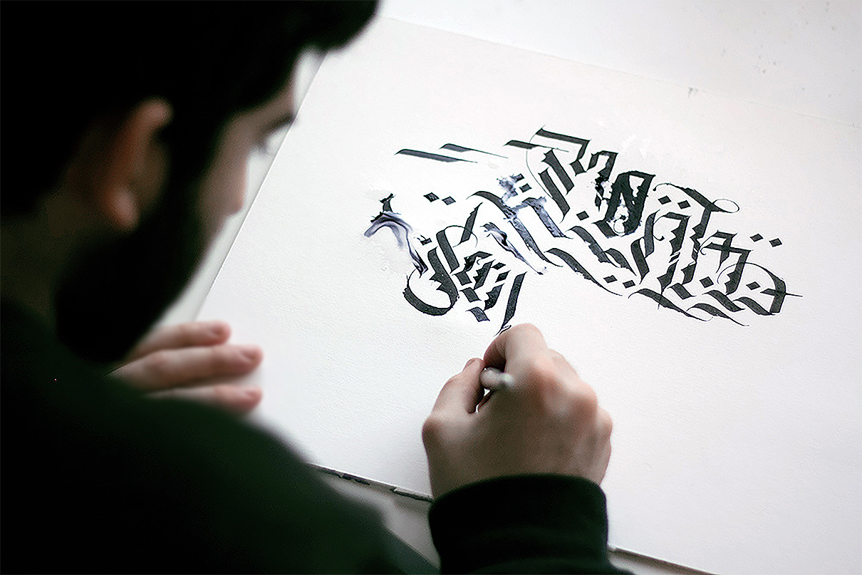
(João) Graffiti nowadays stands as a passion, something I must do. But I never show it as professional work, since both practical and aesthetically it is very distant from it. Graffiti played a significant role in the way I interpret letterforms and have no fear of using color and purely decorative elements. But the truth is, both graffiti and lettering projects, there is always some kind of preparation. Whether it is a loose sketch scribbled on a napkin or a more methodical approach in a series of studies. This is because I feel that sketching is always the best way to give myself clues on what I want, what could work, and what definitely will not. It’s a blurry picture of the final product, but essential to visualize it and get my work going. I do it for both hand-drawn letterings, vectorized letterforms of more free calligraphy. Depending on the situation, these guides can become a strict rule or a mere suggestion.

Photo courtesy João Varela
(VC) As a designer, how has the Coronavirus (Covid-9) pandemic affected your engagement with life as it relates to your collaborations?
(João) As I am currently attending a master’s course, and this was the most affected. More than the classes that I still get online, I am missing the actual experience of the course. I always felt that I learned so much from the day to day discussions with my classmates. This is the biggest downside. As nowadays, most of my freelance work is done remotely, I felt no significant impact on the ongoing projects, a bit slower perhaps. What I do think is that this is a time where people’s minds are closed to new projects and investments, meaning I probably won’t get more commissions during this time. On the other hand, I feel this can be an excellent time to take a step back, focusing on and finishing some projects that were getting dust.
I do not live with an expectation for the ultimate original creation, everything has already been done in one way or another. The question now is how to remix it
(VC) What makes you create the work you do. Are you in any form spiritual or psychological driven like many artists for muses?
(João) I cannot say I have muses or any divine inspirations. I generally tackle every project, more or less, in the same routine. It all starts with a brief, something that probably stuck from my years as a graphic designer. Then follows a lot of research, whether historical or not, this is always a very enjoyable part of the project. I often get very sidetracked and collect many ideas for other future projects. I get my inspiration from these findings. I do not live with an expectation for the ultimate original creation, everything has already been done in one way or another. The question now is how to remix it!
(VC) What can you tell other young creative peers about risks in the creative sector?
(João) Risks must be taken. Always, at all costs. As a creative, your work
needs to be daring and challenge both you and the viewer. Ever
surprising and never stagnated. This can be done through commercial
projects, but also and more importantly, through personal passion
projects. These play a crucial factor in my motivation to keep going as
a creative professional. In terms of business, I feel that there is always a certain amount of risk, particularly when it comes to freelance work. It’s hard to know when or where your next commission is coming from. As a creative, my skills do not at all lie in accounting, contracts, and bureaucracy. I am afraid I am actually very good at neglecting all these aspects and only focusing on the work itself. This is not a very sustainable solution. On advice, I would say to also keep an eye on these areas and will try to do the same.
(VC) Some mention different historical times as a period they admire for artistic affluence or culture If you can time-warp to any era to collaborate with its culture, what time would it be and why?
(João) A tough question, with probably too a contrarian answer. The fact is I find more interest in the usage of historical references nowadays than the idea of that work. The changes of any work have suffered through time and technology, especially on how we perceive them today. I have a total fascination for the photosetting and Letraset era of graphic design, but I find it particularly curious in contrast with the ubiquitous usage of technology. Back then was just the day to day using the available technology, now it’s a choice that brings back lost values. This is very present in the study of calligraphy. I find it essential to learn traditional historic scripts, but by no means do I feel any need to go back to times where monks were locked away copying manuscripts. It is always essential to take a step back, but only so we can take two steps forward.

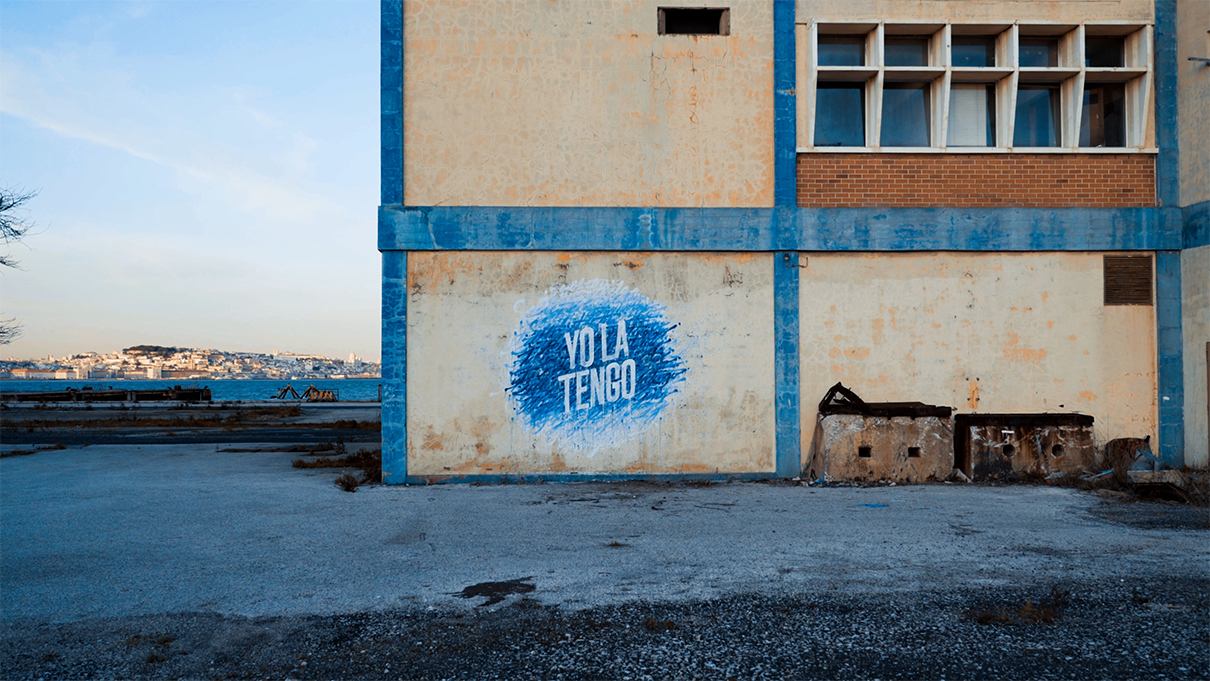
Yo La Tengo by João Varela
(VC) At this stage of your professional accomplishments, If you could collaborate with any brand or public figure in business or the Creative sector who would it be and why?
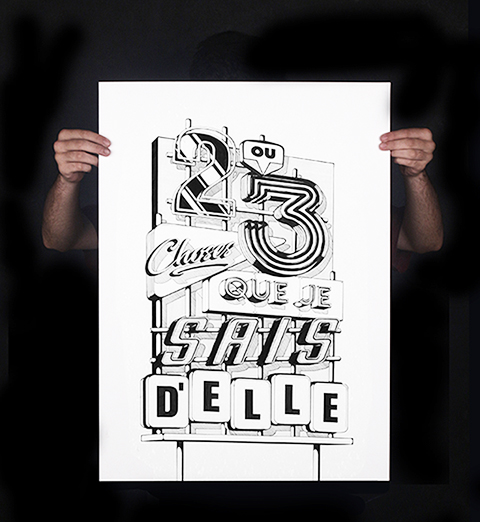
(João) More than brands, or public figures I have this list of things and products I dream of seeing my letters in. In a very raw, unfiltered way with no specific order here are some of them: an animated movie title, a magazine cover, a t-shirt, a street neon sign, a bag of chips, some vinyl stickers, a hardcover book, a huge mural, a sneakers advertisement, an album cover, a wax stamp, a fine silkscreen print, and many others.
(VC) What kind of work or upcoming projects can the world expect from João Varela within the next 24 months?
(João) Currently, I am taking the time in quarantine to produce an overdue website portfolio. With that, I will show some never published projects. Most excitingly, I am finishing my diploma project, an exploration of a variable grid system to construct and explore letterforms. A bridge between technology and hand lettering. Furthermore, I intend to explore some mural work in bigger sizes. But this year and the next will definitely be a rollercoaster since I will be coming out of school and starting a professional career officially, whether in freelance or finding a position in an existing studio.